The Blocky Beauty and the Blurry Beast
When it comes to texture filtering, forgoing the mipmapping and anisotropic filtering techniques for now and just focusing on sampling preferences, there has historically, broadly, been 2 main options: Bilinear and Nearest Neighbour.
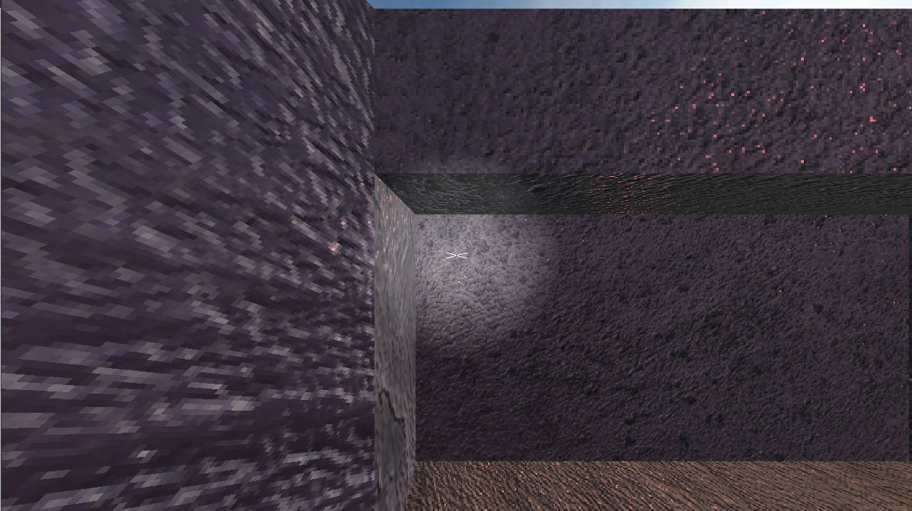 Above: Nearest neighbour example, Below: Bilinear example.
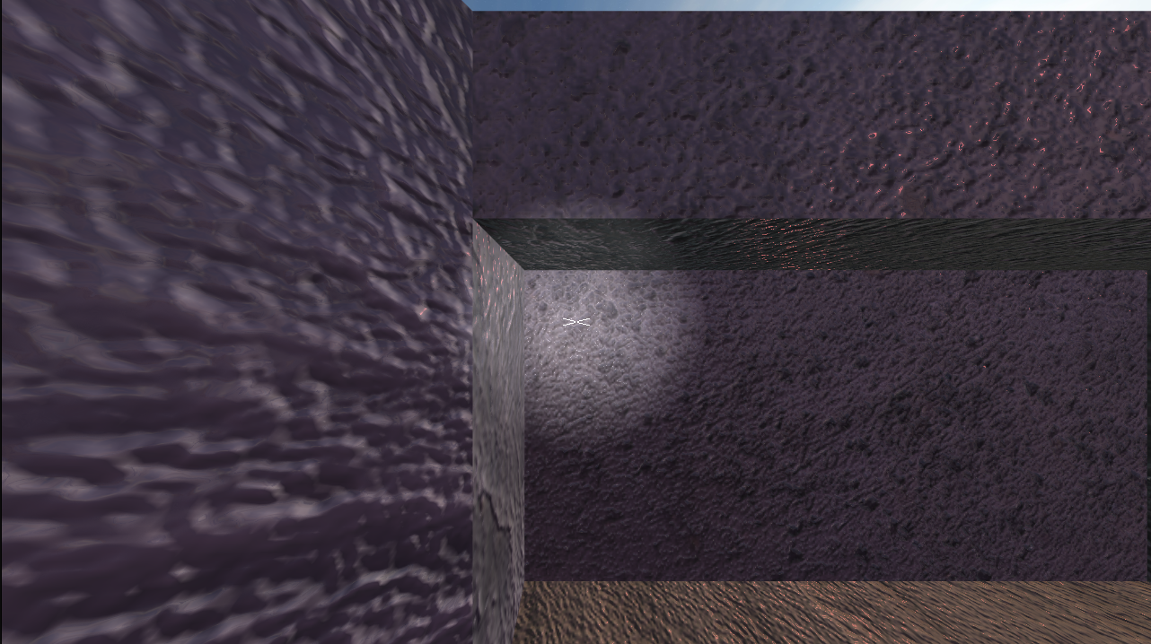
Nearest neighbour just gets the value of the nearest pixel and uses it, while bilinear takes the 4 nearest pixels and interpolates between them based on the distances from them. nearest neighbour was the fastest of the 2 but there is not a huge increase with bilinear.
Nearest neighbour was used in the PS1 and Software rendered PC games of the 90s and so it has come to denote that, while bilinear filtering came in with a smoothness as part of the ‘next generation’ of realistic graphics. One of the biggest influences of the shift was with the shift towards dedicated graphics cards which offered bilinear natively.
Now texture size, anti-aliasing, and postprocessing have gotten to the point that the differences between the choices are minimised, but they do still exist. Nowadays technical limitations are occasionally the reason but mainly when you are noticing the texture filtering, especially when you are talking about Nearest Neighbour,usually means it was an artistic choice.
The cultural aspect that I find interesting is that in discussions about these 2, and therefore in discussions by people with familiarity with texture filtering, nearest neighbour seems to be significantly more popular and liked when it is noticed. However, when talking to those less familiar with them, people tend to have quite a negative reaction to nearest neighbour filtering, I have even had people assume that it must be due to a defect or bug, as they do not believe anyone would intentionally have a texture look like that. I would be remiss to leave out that this appears to have primarily been said constructively, but details are scarce and rarely actionable. The main thing I hear is that the blockiness gives the user a headache, but I have also heard that in relation to when bilinear gets blurry. There may not be a full solution, but given that the complaints appear to occur on the extremes of the texture resolutions this can at least be mitigated.
Like with many things I think this is a thing that is less about personal preference about one method over another and more dependent on your awareness for the proper context in which each method should be used. It is most important if things feel cohesive. nearest neighbour is somewhat relegated to stylisations that fit it, aping the atmosphere of old software, although there can be something nice about the crispness. bilinear, and its derivatives, have always had the potential of looking the most realistic of the two and do a pretty good job of presenting the smoothness is surfaces but can be poor at sharp contrasts without relying on geometry and I have seen it age quite poorly in places, ‘muddy’ is a common description for it, and it can be not great at dealing with transparent areas.

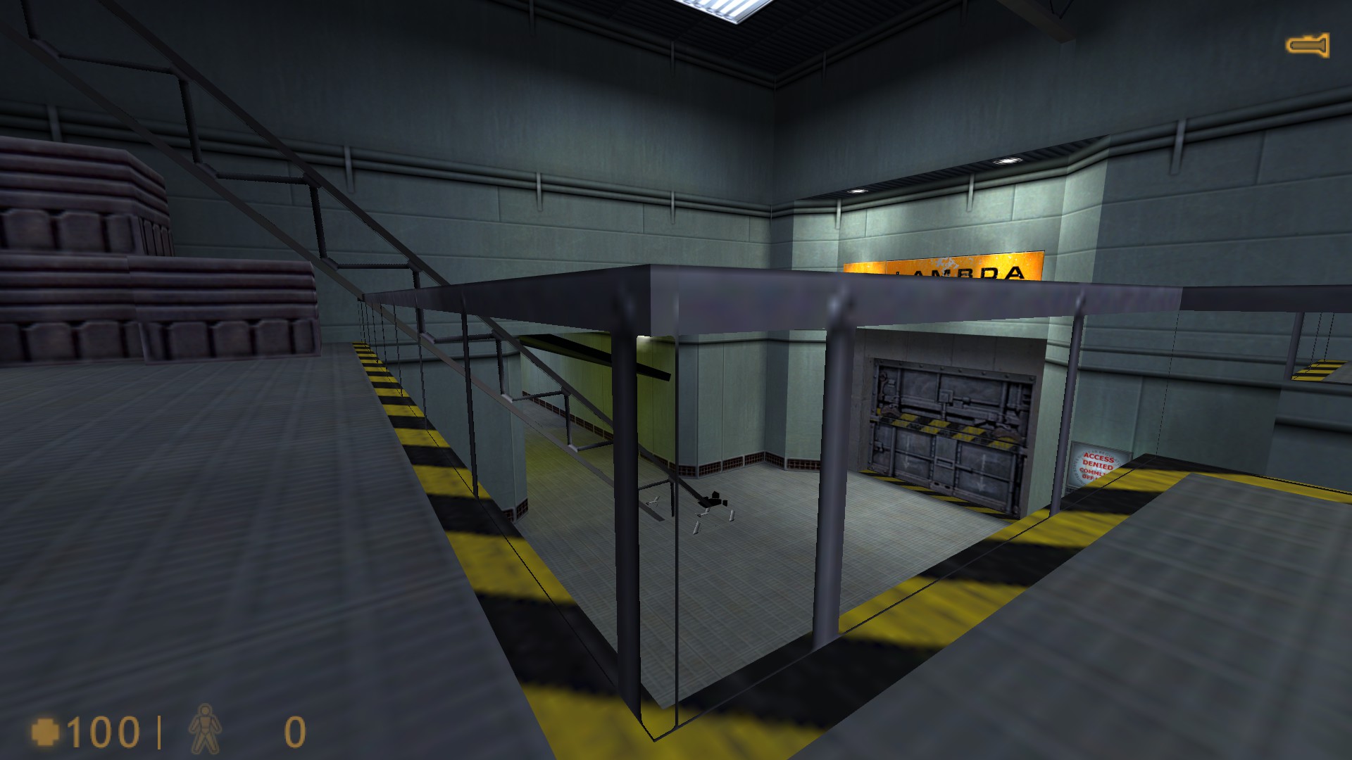 Above: contrasting examples from Half-Life (1998) property of Valve Software where the linear texture filtering has resulted in noticeable lines appearing on the edges of the geometry, coming from areas of the texture that are obscured when using the nearest neighbour sampling the game was designed around.
Bilinear filtering has pitfalls that other methods do remedy and have achieved success. Bicubic and biquadratic interpolation are by no means new methods and do see a fair amount of use but are still are not as widely used, in small part because it is more processing intensive, but mainly because it is not nearly as broadly supported natively by graphics cards, meaning bespoke solutions can be needed.
I do wonder about if the combination and contrast of these effects, or at least the looks that they have, can be used at the same time effectively for an aesthetic purpose, at least without being dismissed immediately. You would have to make some effort to make sure it is clear that the contrast is purposeful. I think the closest I have seen would be with a glitching effect, but I have even seen that be mistaken. It would be nice to see some more experimental stuff around this, I plan to experiment with this in future.
While this has just been my surface level account of how I see people perceiving texture filtering, if you would like a technical examination, I would strongly recommend Bart Wronski’s writeup about bilinear filtering’s issues and alternatives, linked here:
https://bartwronski.com/2020/04/14/bilinear-texture-filtering-artifacts-alternatives-and-frequency-domain-analysis/