Fonts in two(2) forms
For a while now, since approximately the 10th of April 2023, I have been attempting to make a font(s). Not something that I have worked on continuously, but an occasional hobby project that I would chip away at every now and then.
My main tools for creating these have been GIMP for the bitmap work and FontForge for the TrueType.
My initial intentions was for a font built primarily for the context of being rendered as a texture, potentially in a form that can be effectively handled by a GPU or within a similar environment. Hopefully with the result of efficiently and ideally legibly.
Even at the time of when I started I was aware of bitmap fonts and texture atlases as well as how those are used in the context handling fonts. It got me thinking about how that process of rasterizing a font, which typically starts as vectors, has a very different look to fonts that were made from the ground up as bitmaps.
Increasingly rare since the advent of the TrueType format, I do still stumble across bitmap fonts occasionally, like as an option within some terminals or with how IBM z/OS systems physically print text. Classically bitmap font could be found in formats such as PCF, BDF, SNF among other formats.
There is a crispness and sharp elegance that you don’t see with the soft fuzzy edges of gradients and subpixel rendering. Don’t misunderstand me, I love and admire the smooth curvyness of modern text rendering seemingly more than almost anybody I have pestered about the subject. I just also love when it is super not that but still super nice, I am allowed to like both.
So anyway; on the topic of what I have made, both older and modern graphics pipelines are built and optimised for handling textures that have each dimension be a power of 2(two), so whatever I make should have that property. Many handlings of font atlases place glyphs to be most compact, but I thought if the text is monospace and they are in the order each appears in the text encoding, left to right and top to bottom, then the placements can be implicit, you can avoid the complexity of storing and fetching each glyph’s transform from a separate structure.
I wanted something monospace anyway, and if you decide a character’s hull is about twice the height of its width you can provide each one something like 8 by 16 pixels and have them neatly fit within a power of two(2) dimensioned texture, for instance A 512 by 512 texture could fit 2048 characters with no wasted space.
While I have not done all 2048 yet I have filled this out somewhat, at least to a substantial capacity:
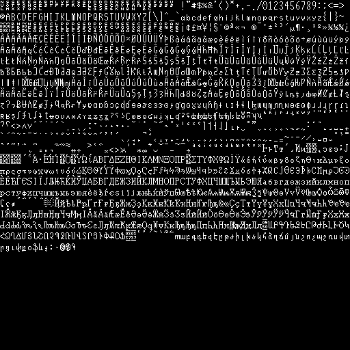
As of writing this, and as you may be able to see, I have done all of the Unicode characters from null up through to the end of Armenian. I hope you will forgive the shortcomings of the more detailed characters as they exist in the more limited form of such a low resolution bitmap.
I’m pretty happy with how this has turned out, it is close to my original intentions, it was built for a specific use case, for which it is perfect. However, I had developed some ambitious affection for the font over the years. and so wanted more for it.
Around August of 2025 I started working on a TrueType format version, deliberately restricted to the same small dimensions for where points can be placed, remaining faithful to the intentions of the bitmap while avoiding it being a pixelated font.
AtlasDarken
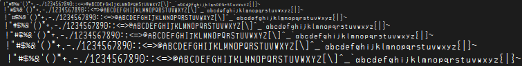
I am happy with how this translation turned out and am very pleased with how it feels faithful and is readable even at very small sizes.
As I am writing this I have implemented the characters from Basic Latin all through all of IPA Extensions. I may add more if I continue to get the urge that sparked all this to begin with.
If you would like to use this font it can be downloaded from: here
So, that font is going well so far, even with its chunky, angular self imposed limitations. However, once I started needing to add things like diacritics I am running up against the limits of the level of detail, especially with the breve.
So, I’m thinking about what It would look like with the curves and more granular precision.
CartographerDarken
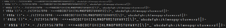
Well it took a rework increasing line thickness to get it this readable, it is still a little small within its space and less sharp at smaller sizes. Still, it has curves and better fine details. It is nice in some places, but I know this is something I will have to keep ruminating on.
If you would like to use this font it can be downloaded from: here
Whether I keep updating this or make a new font I’m still not sure, either way I think I have learned a lot.
A repo containing these fonts, and future ones if and when I make them, can be found here.
In relation to my original use-case.
Now, whether you are making a bitmap font manually or baking in from a more typical format; a limitation in comparison to how fonts are usually handled is the loss of the ability to scale the font in question. At a naive first glance it seems a font bitmap must need to be held in at least the size it will be displayed at, right? Related to the realm of texture atlasing of fonts, but also very useful in many other cases, is signed distance fields, which can be stored and handled as even a quite small raster but can represent a clean boundaried, vector-like, shape.
Signed distance fields are known to have been used for the purpose text rendering on the GPU at least as early as 2007 by Valve Software within several of their games and described in Valve employee Chris Green’s paper Improved Alpha-Tested Magnification for Vector Textures and Special Effects, the use of multiple channels of different directions is also briefly described as a technique for maintaining better preserved sharp points than a single channeled field.
For the further developments on multi-channel signed distance fields see some of Chlumsky’s work: